FLEXBOX AND GRIDS, YOUR LAYOUT’S BEST FRIENDS.
 In the past, CSS float properties were one of the main methods for
arranging elements on a website. And if you’ve ever worked that way,
you know that it’s not always ideal for complex layouts. Luckily in
the modern era of web design, aligning elements has become much more
streamlined thanks to Flexbox and CSS grids.
In the past, CSS float properties were one of the main methods for
arranging elements on a website. And if you’ve ever worked that way,
you know that it’s not always ideal for complex layouts. Luckily in
the modern era of web design, aligning elements has become much more
streamlined thanks to Flexbox and CSS grids.
Flexbox came along, it made alignment much easier and has since been widely adopted. CSS Grid Layouts have also created a lot of excitement in the web design community. Awhile back, we took a look at how to create a basic CSS Grid Layout. Although it is not widely adopted, browsers are starting to adopt support for it. When it is fully supported, this will have a great impact on designs. Browser support is increasing all the time; be sure to check out Can I Use for the most up to date information.
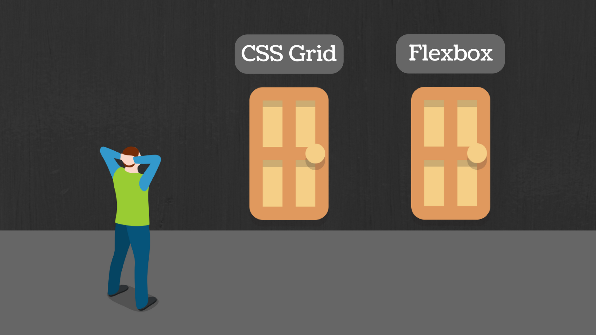
you may be wondering what’s next; after all, Flexbox and CSS Grid Layouts seem to accomplish similar results. It’s not a Flexbox versus Grid debate, however, but more of learning how to use them together. The more I’ve played around with both Grid and Flexbox, I’ve found that you don’t have to choose just one or the other. In the near future, when CSS Grid Layouts have full browser support, designers will be able to take the combined advantages of each and create the most efficient and interesting designs.
CSS grid works best for more complicated layouts. Think of CSS grid as a way to anchor multiple elements onto a page. Grid is practical for layouts that have multiple blocks of content and images that you need to organize. Flexbox isn’t as useful for these more involved layouts, because it only lets you control how the elements are arranged in a single direction.
Of course CSS grid and flexbox can work together in a layout. You can use flexbox inside CSS grid and vice versa. For instance, you could use flexbox to center an element like a button both vertically and horizontally within a particular grid cell (since centering with other CSS methods is … tricky). And you could also flip this scenario, using grid to control the placement of data within cards whose layout is determined, at a higher level, by flexbox. This can be really handy for combining the flexibility of flexbox with the precision of grid for cards that contain a wealth of data, such as you might need for real estate listings.
You can learn much more about using flexbox and grid together!